Time History of Atmospheric CO2
http://www.esrl.noaa.gov/gmd/ccgg/trends/history.html
http://www.esrl.noaa.gov/gmd/ccgg/trends/history.html
NOAA Earth System Research Laboratory, Carbon Tracker Program
Animation length: 3:15 minutes.
Learn more about Teaching Climate Literacy and Energy Awareness»Grade Level
Topics
Climate Literacy
This Simulation/Interactive builds on the following concepts of Climate Literacy.
Click a topic below for supporting information, teaching ideas, and sample activities.
Notes From Our Reviewers
The CLEAN collection is hand-picked and rigorously reviewed for scientific accuracy and classroom effectiveness.
Read what our review team had to say about this resource below or learn more about
how CLEAN reviews teaching materials
Teaching Tips | Science | Pedagogy |
Technical Details
Teaching Tips
- There are multiple data sets represented in the visualization and thus it will need explanation by the teacher.
- This visualization would best be shown to an entire class with narration by the teacher as opposed to students looking at the visualization by themselves. College-level students would not need as much support.
About the Content
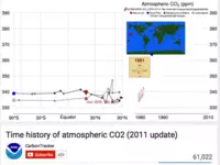
- Visualization begins with data from 1979, showing the seasonal variations in atmospheric CO2 as well as the global distribution through the year. The animation continues to the present, showing the rise in CO2. Alongside the main graph, a cumulative plot of CO2 animates the Keeling curve over time. The animation then moves into exploring pre-industrial and ice age atmospheric CO2 concentrations.
- This animation is called the "pumphandle" because the seasonal up/down of CO2 resembles the pumping of an old-fashioned well handle.
- At the time of review, the data was current (2024). This resource may update automatically as new data becomes available.
- Comments from expert scientist: This is a nice animation showing the measurements of atmospheric CO2, and the increase through time since measurements began at NOAA in 1979. It clearly shows the increase through time and the overlying seasonal cycle in the Northern hemisphere. This animation shows the actual measurements made at NOAA/ESRL CO2 measurement sites around the world that have been and continue to be used to determine the atmospheric CO2 concentration.
About the Pedagogy
- Animation is data-rich and students will likely need multiple viewings. Even if students do not understand ppm, the visual impact of the increase in CO2 concentration since pre-industrial times is hard to miss.
- Comment from expert scientist: This presents the data nicely, but includes very little information about what it means. Educators wanting to use this resource may have to look elsewhere (e.g. on the linked website) to find more information.
- See http://www.esrl.noaa.gov/gmd/ccgg/carbontracker/ for more information on the Carbon Tracker.
- This resource engages students in using scientific data.
See other data-rich activities
